

Okay~ I have another one to check.
Just seeing if I can do different styles back to back, without having to be in the mode.
btw.I'm loving the idea and affects for Swanky.
9/10 'cause of the character outline.---> though I had cutting those out myself.
-Monstah, I don't know what to say about that one. lol I can see the paint you did for the swirly things, I give you a 7 for concept.
Results 1,051 to 1,060 of 1683
Thread: Rate the Signature Above!
-
01-05-2011, 08:08 PM #1051Osmium

- Join Date
- Dec 2010
- Location
- In a land far far away when Donkey's eat Unicorns while they play Monopoly.
- Posts
- 667


Click on the picture, cutie!
-
01-05-2011, 08:09 PM #1052Titanium
- Join Date
- Oct 2010
- Location
- San Diego
- Posts
- 87
make me one
-
01-05-2011, 08:44 PM #1053Banned
- Join Date
- Aug 2010
- Location
- shhh
- Posts
- 1,871

Here is the previous version for comparison.
 [/QUOTE]
better than the previous version but why dont u put a better background (or w/e u guys call it).instead of just ice put something better. looks like hes at the north pole lol
-
01-06-2011, 01:25 AM #1054Banned
- Join Date
- Oct 2010
- Posts
- 888
4 - lacks blending
-
01-06-2011, 08:53 AM #1055Shadow Titanium
- Join Date
- Apr 2010
- Posts
- 384
9/10 Xiju
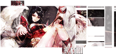
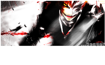
infiCathi: I like it overall, but the white streaming out of the Ichigo sig isn't my favorite, may be more of a style preference for me. 8.5/10
I wanted an icy scene since the character is associated with using ice in the game he comes from. And it was winter when I started working on this, lol. On a side note, I was originally making this as a wallpaper, but I thought this would be a good subject to try and help me develop new techniques and better lighting and blending skills. Originally Posted by XFearMyBladeX

Last edited by cadacus_ater; 01-06-2011 at 09:07 AM.


-
01-06-2011, 12:09 PM #1056Drei
- Join Date
- Apr 2010
- Location
- Guild: Seireitei
- Posts
- 3,798
i made a new one
simple and easy make

This page has had 35,723 visits (Retired)
My FB Guide
Contact me for anything for the wiki: [email protected]
-
01-06-2011, 12:18 PM #1057Shadow Titanium
- Join Date
- Sep 2010
- Posts
- 445

z.z, tell me what u think? this is 1st sig in about a 2months so im not expecting much( note to yum: i tried some blending/smudging around the water ripples...idk if it is good or not)
-
01-06-2011, 01:21 PM #1058Banned
- Join Date
- Apr 2010
- Location
- In a cookie jar
- Posts
- 1,026
What I mean by blending is that the picture/ render has to go with the background. In your latest sig, It looks so randomly placed. Blending can be many things, as long as the picture goes with the background. This can be achieved by adjusting the lighting, making the colors match, etc. Just keep practicing Originally Posted by Tysukiomi
-
01-06-2011, 01:24 PM #1059Shadow Titanium
- Join Date
- Sep 2010
- Posts
- 445
meh, to me this picture sorta matched the background, i couldn't think of any good ideas for it but i had to try another sig z.z, ive only made like 15 of the dang things and seems like i do get somewhat better as i make more so like u said, practice z.z
thanks for the advice
anyways time to go back into photoshop and work on that sig some more then ill post a later edited version of it
-
01-06-2011, 01:50 PM #1060Junior Member
- Join Date
- Dec 2010
- Posts
- 31
Originally Posted by Tysukiomi
Its hard to have an eye for these kind of stuff. Trying going to deviantart.com and look at some of the gfx examples to get an idea of what flows.
Your red sig would have look a lot better if the flames were centered right behind the character and spreading outwards... not placed randomly. But people have their own style and ways of looking at things. If you send me those stock pics I can help make you a better example.

 Reply With Quote


 Posting Permissions
- You may not post new threads
- You may not post replies
- You may not post attachments
- You may not edit your posts
Bookmarks