

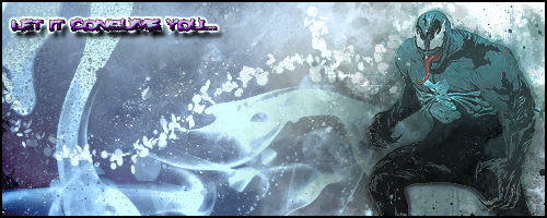
:E Huhm. There's something about it that's throwing me off. You could probably mess with the glow around him more to match the background, I recommend a white since the sig itself has a white glow, so it blends in more, though I do like the yellow glow itself, emitting from him.
^^^^ though the bottom where it cuts off is something that baffles me.
6/10.
I love the background though, reminds me of Tron. o.o
Results 1,081 to 1,090 of 1683
Thread: Rate the Signature Above!
-
01-15-2011, 08:45 AM #1081Osmium

- Join Date
- Dec 2010
- Location
- In a land far far away when Donkey's eat Unicorns while they play Monopoly.
- Posts
- 667


Click on the picture, cutie!
-
01-15-2011, 12:20 PM #1082Banned
- Join Date
- Apr 2010
- Location
- In a cookie jar
- Posts
- 1,026
I'm mostly on FringeFX.net now... :x
-
01-17-2011, 03:26 PM #1083Shadow Titanium
- Join Date
- Apr 2010
- Posts
- 452
ooo that site is pretty nice.
 ! Very good for inspiration.


Retired from Cabal
-
01-18-2011, 05:32 PM #1084Junior Member
- Join Date
- Aug 2010
- Location
- Most likely at home or playing futbol
- Posts
- 45
Edit:Forgot a border

had some spare time, found a new render, and this is the product.
Would love for someone to teach me some stuffs
Last edited by Maxisback; 01-18-2011 at 05:40 PM.
When you're bored...
If anyone can teach me how to make a better signature, PLEASE DO.
I wish to learn.
-
01-19-2011, 04:49 AM #1085Junior Member
- Join Date
- Dec 2010
- Posts
- 31
the text is barely readable but everything else looks nice. Try to play with the outline glow a bit by spreading it further to make it blend a little easy.
----
New Sig (WARNING: Only works on white backgrounds)
No Stock Images, 100% Photoshop.
Below.
-
01-19-2011, 05:22 AM #1086Osmium
- Join Date
- Dec 2010
- Location
- In a land far far away when Donkey's eat Unicorns while they play Monopoly.
- Posts
- 667
7/10 for Max
10/10 for Swanky. Liquify?
Click on the picture, cutie!
-
01-19-2011, 06:27 AM #1087Junior Member
- Join Date
- Dec 2010
- Posts
- 31
yup, liquify for some parts. Best way to not lose the quality of the image when morphing the image around. Almost as good as using illustrator but 10 times easier.
-
01-19-2011, 07:19 AM #1088Shadow Titanium
- Join Date
- Apr 2010
- Posts
- 382
I loathe illustrator ._.
Already told ya what I think on our forums Swank
This is for Sei forums, so it's not PNG yet, hence the obnoxiously large black block.
I got lazy xD

o.o isn't the little kiwi bird dude cute? xD
Kealie - Mercury ;; 180 FA ;; SEIREITEI ;; PRO SIG

-
01-19-2011, 07:48 AM #1089Junior Member
- Join Date
- Dec 2010
- Posts
- 31
They haven't seen ur true artworks yet. Keals is the one of the few people on this forum that can design a clean and professional sig/design.
I envy your illustrator skills. The only thing I can do on that program is outline drawings for my cgi artworks. But that was years ago....
-
01-19-2011, 07:53 AM #1090Shadow Titanium
- Join Date
- Apr 2010
- Posts
- 382
XD Shhh Swank. Thank you though. (:
DUDE. Why did you take your sig down!? PUT IT BACK UP DAMNIT.
Pakiiii <3
10/10 for use of empty sig-less space xD
Kealie - Mercury ;; 180 FA ;; SEIREITEI ;; PRO SIG

 Reply With Quote

 Posting Permissions
- You may not post new threads
- You may not post replies
- You may not post attachments
- You may not edit your posts
Bookmarks