


Too lazy to change the size lol
P.S: 9.5/10
Very nice design to it and the background flows well with the pic. IMO, a different font colour would be nice. ><
Results 451 to 460 of 1683
Thread: Rate the Signature Above!
-
05-07-2010, 01:09 PM #451Titanium

- Join Date
- Apr 2010
- Location
- Canada
- Posts
- 159
Last edited by EliteDragon17; 05-07-2010 at 01:12 PM.
-
05-07-2010, 01:24 PM #452Banned
- Join Date
- Apr 2010
- Location
- In a cookie jar
- Posts
- 1,026
You're sig is too small!! Fix ittt!
/denied rating D:
@Cyrstal
Wow that's really good o_o Everything goes well nicely. I really don't know how you could improve it except for the random lines going through his head...they seem to not belong. Well anyways, solid looking sig for me.
9.8/10
@Error, ah I see now Is this any better?

-
05-07-2010, 01:35 PM #453Titanium
- Join Date
- Apr 2010
- Location
- Behind that bridge
- Posts
- 174
Tbh, it's not much better. Light source is too far from the render and barely adds any effect to it. 6/10 Originally Posted by YumCookies

The first version has a nicer array of colors, this newer one seems to have flatish colors. (Try to use burn tool!)
And for your lighting are you using the filter? Try to use some brushes (doesn't have to be white! possibly a light bright color like a light pink or light blue for example) and set those to overlay or color/linear dodge with opacity reduced. To make the lighting more real, use black brushes but lower opacity and possibly do overlay/soft light to bring out a nice contrast(like the left side, it looked pretty nice before).
Haha, sorry if I'm confusing you or anything.
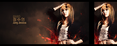
@CyrStal: 7/10 It's interesting but honestly it looks like you did a lot of airbrushing and clogs up the depth. Could use some more colors and a definite lighting source.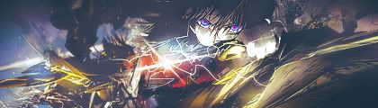
-
05-07-2010, 01:39 PM #454Banned
- Join Date
- Apr 2010
- Posts
- 741
lol
-
05-07-2010, 01:41 PM #455Banned
- Join Date
- Apr 2010
- Location
- In a cookie jar
- Posts
- 1,026
I'm just using a smudged white cloud. :\
-
05-07-2010, 02:04 PM #456Titanium
- Join Date
- Apr 2010
- Location
- Canada
- Posts
- 159
The file is too big D: (40.4 kb) Originally Posted by YumCookies
Your sig:
9/10
The blur in the top-right is a bit distracting, but the rest fits together nicely =)Last edited by EliteDragon17; 05-07-2010 at 02:13 PM.
-
05-07-2010, 07:57 PM #457RedOsmium
- Join Date
- Apr 2010
- Posts
- 1,218

^_^
-
05-07-2010, 09:30 PM #458Banned
- Join Date
- Apr 2010
- Location
- In a cookie jar
- Posts
- 1,026
^ Rated already
Andddd moreeee reworkinggggg

-
05-08-2010, 09:47 AM #459Osmium
- Join Date
- Apr 2010
- Location
- In your mind.
- Posts
- 846
9/10!
-
05-08-2010, 01:58 PM #460Banned
- Join Date
- Apr 2010
- Location
- Manitoba, Canada
- Posts
- 586
I like the second one, looks like you screwed up on the first one a little.
5/10
9/10


 Reply With Quote


 Posting Permissions
- You may not post new threads
- You may not post replies
- You may not post attachments
- You may not edit your posts
Bookmarks