


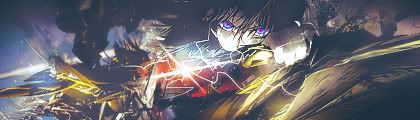
-1 Sonic render is hard to see
-1 Overly blended, way too many effects going over him.
-1 Text, the bottom right and the actual 'Sonic'. I personally don't like the emboss/gloss/outline text.
-1 Random FX, too bright in one spot and more darker in another. Almost like a light source, except the bright is all over one half of the tag.
6/10
Really nice, you've improved a lot.Originally Posted by YumCookies

8/10
-Your light source is just a big white negative space, try to stay away from that.
-Render seems awfully flat, hard to see much depth.
Also I feel that it's an overly bright tag...idk, maybe do some burning or try to bring out the contrast.
The line for your name could be reduced a little. Maybe do a clipping mask with a B&W gradient layer going like this and tweak the opacity/layer setting a bit.
Results 391 to 400 of 1683
Thread: Rate the Signature Above!
-
05-05-2010, 03:19 PM #391Titanium

- Join Date
- Apr 2010
- Location
- Behind that bridge
- Posts
- 174
-
05-05-2010, 03:25 PM #392Osmium
- Join Date
- Apr 2010
- Location
- SEGA
- Posts
- 902
 WHAT!1!!!one!11!! Originally Posted by Error
this is an outrage
you will hear from my lawyer sir
gagagagaSonicCinos
PalmtopTaiga

-http://i46.tinypic.com/2hrjzas.png-
-
05-05-2010, 03:28 PM #393Banned
- Join Date
- Apr 2010
- Location
- In a cookie jar
- Posts
- 1,026
Haha thanks! Really?? I love the brightness of it! XD Originally Posted by Error
@ERror
10/10
Really nothing else that could be done to it...everything looks solid already :P
-
05-05-2010, 03:39 PM #394Banned
- Join Date
- Apr 2010
- Location
- N/A
- Posts
- 3,643
10
-
05-05-2010, 03:40 PM #395Red-Osmium
- Join Date
- Apr 2010
- Posts
- 1,001

 Originally Posted by YumCookies
wait is that from Angel beats? coz that one from Angel Beats and Suzumiya haruhi both look alike =P
anyways for that one 8/10 (didnt like the water drop effect much)
as for ur own sig RITSU!!! 9/10 (9! moe kyun! hehehe)
-1 coz i feel like that one part was too bright. well i just dun like those too bright ones XD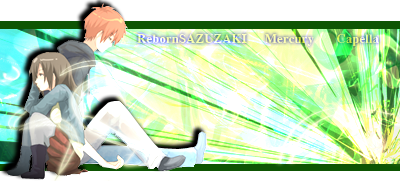 My name aint "REBORN" for nothin >:]
-
05-05-2010, 04:11 PM #396Banned
- Join Date
- Apr 2010
- Posts
- 124
edit: forgot to rate reborns. 9/10 i like the depth
I made some new ones, trying to make them faster so they might not be that great of quality..
The first one I think is lol, my friend came up with the idea.


And this one is for Yum because I know she/he likes this kind of stuff.

Rates from everyone WeewLast edited by Sniper; 05-05-2010 at 04:17 PM.
-
05-05-2010, 04:37 PM #397Banned
- Join Date
- Apr 2010
- Location
- In a cookie jar
- Posts
- 1,026
1st one: Originally Posted by Sniper
I love the vectored look to it.
An easy 9.5/10
2nd one:
Wow that one is great! Nice blending, effects, etc. Just not too big of a fan on the text and the bottom left corner!
9/10
3rd one
Pshhh -.- I don't like the mosaic background and the random brush strokes :P
7.5/10
Reworked the lighting/ some depth with my sig.

Rate this one and the one I have right now please
-
05-05-2010, 04:42 PM #398Banned
- Join Date
- Apr 2010
- Posts
- 124
You finally added color
 9.7/10
Damn so close that time.
-
05-05-2010, 04:44 PM #399Banned
- Join Date
- Apr 2010
- Location
- In a cookie jar
- Posts
- 1,026
Oh right, forgot to tell you. Add more depth to the second one. Originally Posted by Sniper
Reworked lighting/ depth issues. Any better?
-
05-05-2010, 05:26 PM #400Banned
- Join Date
- Apr 2010
- Posts
- 124
I have a really good idea for one that you will think is a 10/10 Yum! I seem to have trouble with text so i'll just leave it out. I'll hopefully have it finished tomarrow..
edit: i'm working on two now might only get 1 done though
Oh and as a heads up; you might want to bring an extra pair of pants.Last edited by Sniper; 05-05-2010 at 05:36 PM.


 Reply With Quote


 Posting Permissions
- You may not post new threads
- You may not post replies
- You may not post attachments
- You may not edit your posts
Bookmarks