

holy I love you >.<♥I love you >.<♥I love you >.<♥ TYSU!!!!! LOG ON GAME FOOOO LIKE NAO!!!!!!!!!!!!!!!!
Results 1,311 to 1,320 of 1683
Thread: Rate the Signature Above!
-
03-08-2011, 05:52 PM #1311Banned

- Join Date
- Aug 2010
- Location
- shhh
- Posts
- 1,871
-
03-09-2011, 02:23 AM #1312Shadow Titanium
- Join Date
- Apr 2010
- Posts
- 384
Nice sig
This is how I felt when I finished LH Hard for the first time:

Got a bit hot in there.Last edited by cadacus_ater; 03-09-2011 at 02:44 AM.


-
03-09-2011, 11:51 AM #1313Shadow Titanium
- Join Date
- Apr 2010
- Posts
- 382

4/10
More blending the text up top is semi hard to read, you cant really tell what the character is or is doing in the image. Make more of him visible and add more color contrast. It'll brighten up the dull blurred look the fire has.
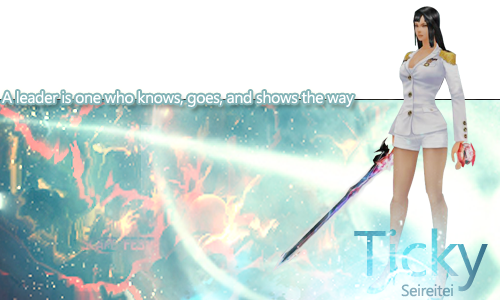
Quickie signature I made for Ticky lastnight. Made an animated one last night but I cant get fkn photoshop to render it properly. *kicks* STupid low quality shet.
Kealie - Mercury ;; 180 FA ;; SEIREITEI ;; PRO SIG

-
03-09-2011, 02:26 PM #1314Osmium
- Join Date
- Dec 2010
- Location
- In a land far far away when Donkey's eat Unicorns while they play Monopoly.
- Posts
- 667


8/10.
o.O the box seems a little overwhelming, but otherwise the balance between the colors in it is good. I love the fade out of the character's feet around the name, but it could be a little bright, when viewed on a white forum.
otherwise I like the position, the text, and everything else.
gg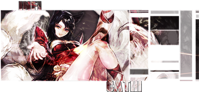
Click on the picture, cutie!
-
03-09-2011, 03:40 PM #1315Shadow Titanium
- Join Date
- Apr 2010
- Posts
- 384
I was trying some new things, the render was from a screen shot of force kick and there was a lot of unnatural coloration and distortion so I tried to smudge some of it and cover the rest with effects (in this case, fire), but I went overboard. Originally Posted by Liever

The fire was a few layers of a couple different fractals I made in Apophysis, set on screen for the most part. It looked a little better when I was working on it, when i tried to flatten the image it didn't come out right.... I might try tinkering with Curves to try and help with contrast here and there, but the entire sig needs reworking. Hopefully I'll figure out where I messed up and improve it without too much trouble.
-
03-11-2011, 10:59 AM #1316Banned
- Join Date
- Apr 2010
- Location
- In a cookie jar
- Posts
- 1,026
5/10
Effects need more blending and the text is a bit ehhhh
-
03-11-2011, 11:01 AM #1317Banned
- Join Date
- Aug 2010
- Location
- shhh
- Posts
- 1,871
o.o YUM ur sigs are soo 100 years ago.... x.x Originally Posted by YumCookies
-
03-11-2011, 11:48 AM #1318RedOsmium
- Join Date
- Apr 2010
- Posts
- 1,218
Fear that was mean
-
03-11-2011, 11:49 AM #1319Banned
- Join Date
- Aug 2010
- Location
- shhh
- Posts
- 1,871
nuu i mean yum should update his sigs :O i ish a nice person Originally Posted by CyrStalAFX
^_^
-
03-11-2011, 11:51 AM #1320RedOsmium
- Join Date
- Apr 2010
- Posts
- 1,218
^_^ ok

 Reply With Quote


 Posting Permissions
- You may not post new threads
- You may not post replies
- You may not post attachments
- You may not edit your posts
Bookmarks