

Results 1,011 to 1,020 of 1683
Thread: Rate the Signature Above!
-
12-03-2010, 03:02 PM #1011Banned

- Join Date
- Dec 2010
- Posts
- 129
-
12-03-2010, 10:12 PM #1012Shadow Titanium
- Join Date
- Apr 2010
- Posts
- 452
o.o


Retired from Cabal
-
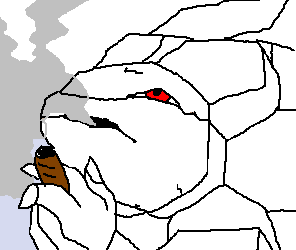
12-04-2010, 05:21 AM #1013Banned
- Join Date
- Dec 2010
- Posts
- 129
What, you can't rate a golem smoking a blunt? Originally Posted by Suzaku0

-
12-05-2010, 08:14 PM #1014RedOsmium
- Join Date
- Apr 2010
- Posts
- 1,218

-
12-05-2010, 08:18 PM #1015Banned
- Join Date
- Nov 2010
- Posts
- 1,345
since when are blunts wrapped in brown paper and thicker than a lighter? Originally Posted by LethalHǝart
-
12-06-2010, 10:58 AM #1016Banned
- Join Date
- Dec 2010
- Posts
- 129
Since my MS paint skills make everything look like a cigar. But it whatever I say it is, so it's a blunt. Originally Posted by Mat
IE: Red eyes, huurr...
-
12-13-2010, 08:32 AM #1017Shadow Titanium
- Join Date
- Apr 2010
- Posts
- 384
It has been a long time...
Looking for some commentary and/or ratings on this one. Not sure if I'll make it a sig yet. I'm especially wondering about lighting, and ways I might improve the ice. For the ice I made a rough sketch of it and did an inner bevel, some glow effects and a satin texture, then layered the result onto itself a few times, masking different portions on each layer. One thing I would like tips on if possible is ways to make smooth portions of ice look more like ice and not as much like the background. Can this be done by effects, shading, etc. or should I take more care with making my sketch for the inner bevel? Of course, commentary on other aspects of the draft is welcome too.

Last edited by cadacus_ater; 12-13-2010 at 08:45 AM.


-
12-13-2010, 08:54 AM #1018Banned
- Join Date
- Dec 2010
- Location
- Orange County , CA
- Posts
- 316

10 ^^
because it looks like she has sharingan =]
-
12-13-2010, 12:02 PM #1019Titanium
- Join Date
- Apr 2010
- Location
- Behind that bridge
- Posts
- 174
I'm not exactly sure but you can try to do some hue/saturation and levels layers to change the color. Or you can simply do a white brush over the areas you want and change the opacity settings or layer settings. Then erase parts you don't want changed. I'm not really sure how you would do the lighting either lol, try adding a fractal on color dodge/linear dodge/overlay with erasing and opacity adjustments. Originally Posted by cadacus_ater
Sorry, I I love you >.<♥I love you >.<♥I love you >.<♥I love you >.<♥ at advice lol.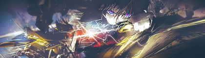
-
12-16-2010, 07:44 PM #1020Shadow Titanium
- Join Date
- Apr 2010
- Posts
- 384
I appreciate the comments. I think I'm learning more effective use of GIMP, but I can always improve further. Perhaps something more like this would work. Please rate and/or comment; critiques and advice are welcome. Originally Posted by Error

Well, idk. Ice at least looks a bit better to me, perhaps lighting is too, but I'm open to suggestions.

 Reply With Quote


 Posting Permissions
- You may not post new threads
- You may not post replies
- You may not post attachments
- You may not edit your posts
Bookmarks