

5/10
It needs to be blended in a lot more, because as of right now it just looks like an ice picture with a picture pasted on top of itYou have to make the character match the scenery!
Results 1,021 to 1,030 of 1683
Thread: Rate the Signature Above!
-
12-24-2010, 04:16 PM #1021Banned

- Join Date
- Apr 2010
- Location
- In a cookie jar
- Posts
- 1,026
-
12-25-2010, 08:26 AM #1022Osmium
- Join Date
- Dec 2010
- Location
- In a land far far away when Donkey's eat Unicorns while they play Monopoly.
- Posts
- 667


tbh, something on the ice looks a little off, but it's a gorgeous idea.
you should try looking at a real piece of ice, or another anime version, and see if you can't check the similarities or differences, and work on it, with that on the side.
a light opacity of a flame fractal would look nice.
Click on the picture, cutie!
-
12-26-2010, 10:43 PM #1023Shadow Titanium
- Join Date
- Apr 2010
- Posts
- 384
Thanks for the comments. I'll see what I can can come up with. May take me a while, I'm trying to get a new computer setup. Gonna have to setup gimp plugins and such all over again.
PS: Sorry if I haven't been doing ratings much. I will say that I like what I'm seeing, but I've been feeling like I'm not quite experienced enough to give a meaningful rating, lol.

-
12-27-2010, 06:10 PM #1024Junior Member
- Join Date
- Dec 2010
- Location
- California
- Posts
- 4
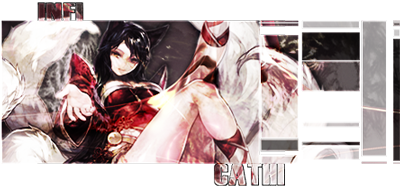
infiCathi
9/10
Amazingly, done. I'd actually like to try something like yours. Or have a one made for me like this.
Though my rendering skills aren't as great, but eh..imagine perfection.

.panic
-
12-27-2010, 08:38 PM #1025Osmium
- Join Date
- Dec 2010
- Location
- In a land far far away when Donkey's eat Unicorns while they play Monopoly.
- Posts
- 667
 Originally Posted by cadacus_ater

 Hey, any rating is good, it's art critics, right? You're part of the art community, your voice should be heard, for more then just asking for advice.
Originally Posted by xgkm
Haha thanks. I love the colors on yours, and the circles you do reflecting spider man. <------------- 10/10 for the words alone. I I love you >.<♥I love you >.<♥I love you >.<♥I love you >.<♥ at putting text together.----> plus the angle.
Did you find that pic somewhere, or did you do it yourself? o.o
Click on the picture, cutie!
-
12-28-2010, 03:00 PM #1026Junior Member
- Join Date
- Dec 2010
- Location
- California
- Posts
- 4
Thank you. Originally Posted by infiCathi
That actually took me a bit to figure it out. But I still love it.
And about the picture, I actually found it out of a stock a while ago it originally has 3 people in the picture.
It was a lot of smudging, and blending, and gradiant maps.
Ugh.
Hahaha..imagine perfection.
.panic
-
12-29-2010, 09:54 PM #1027Banned
- Join Date
- Oct 2010
- Posts
- 888
4
the low quality-ness and the sharpness of almost the whole thing kinda hurts my eyes =[
-
12-30-2010, 12:17 PM #1028Banned
- Join Date
- Dec 2010
- Posts
- 40
dont mind me just dumping the greatest signature ever made by the greatest creator of all time
crystalafx for life gettin that tattooed straight on my ass
-
12-30-2010, 02:41 PM #1029RedOsmium
- Join Date
- Apr 2010
- Posts
- 1,218
^_^
-
12-31-2010, 07:57 AM #1030Banned
- Join Date
- Apr 2010
- Location
- N/A
- Posts
- 3,643
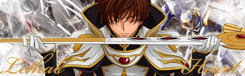
lol Originally Posted by LєthalHeart

 Reply With Quote


 Posting Permissions
- You may not post new threads
- You may not post replies
- You may not post attachments
- You may not edit your posts
Bookmarks