

D:< IUNNO WTF IS MISSING IN THIS THING. And the guy who wanted it isn't responding to me.
QQ -------~> other forums.
or have the text show up more. >> I actually just really like the random white thing there.
Results 1,041 to 1,050 of 1683
Thread: Rate the Signature Above!
-
01-04-2011, 02:15 PM #1041Osmium

- Join Date
- Dec 2010
- Location
- In a land far far away when Donkey's eat Unicorns while they play Monopoly.
- Posts
- 667


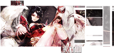
Click on the picture, cutie!
-
01-04-2011, 04:43 PM #1042Shadow Titanium
- Join Date
- Sep 2010
- Posts
- 445
if u look close u can see the checkered pattern from photo shop -.-"
fix that and 8/10 ^_^
-
01-04-2011, 06:19 PM #1043Banned
- Join Date
- Dec 2010
- Location
- Orange County , CA
- Posts
- 316
Hows about we dont look close & then it will be perfecto! =) Originally Posted by Tysukiomi

-
01-04-2011, 07:13 PM #1044Osmium
- Join Date
- Dec 2010
- Location
- In a land far far away when Donkey's eat Unicorns while they play Monopoly.
- Posts
- 667
lol can you point it out for me? I don't see it. o.O Originally Posted by Tysukiomi
Click on the picture, cutie!
-
01-04-2011, 09:12 PM #1045Shadow Titanium
- Join Date
- Sep 2010
- Posts
- 445
look closely beside the hair on the left side Originally Posted by infiCathi
then look at the bottom of his feet under ur logo
-
01-04-2011, 11:52 PM #1046Shadow Titanium
- Join Date
- Apr 2010
- Posts
- 384
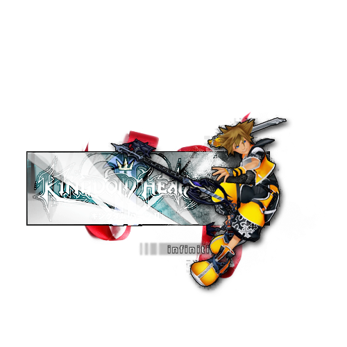
6/10 Tysukiomi. It looks ok in general, but it does have room for improvement. Right now it seems a bit chaotic to me, could probably use a bit of editing in its color/blending and theme. I think I'm a little bit nice with criticism though, but I almost never give anything 10/10 lol. Take my advice with a grain of salt, I'm still learning.
I came up with a revision of my previous offering (started with a 1600 by 900 and scaled it down to 711 by 400). Used a different approach to create the ice formation. I like it better in some ways, but I like the shininess of the previous work also. This one I think looks a bit more defined at least, but I'll probably work on it further at some point, as it's not quite where I want it. However, I wanted to get some feedback on my revisions so far to see if I'm headed in the right direction.
Tried to re-utilize some techniques I used on my current sig to get a better lighting and blending of the character with the scene, hopefully I've made some progress with that aspect. Please rate and comment. As always, I welcome suggestions and criticism.
EDIT: I have a more up to date version, slightly different on page 108 of this thread.

Here is the previous version for comparison.

Last edited by cadacus_ater; 01-07-2011 at 09:17 AM.


-
01-05-2011, 03:29 AM #1047RedOsmium
- Join Date
- Apr 2010
- Posts
- 1,218
^_^
-
01-05-2011, 07:47 PM #1048Banned
- Join Date
- Dec 2010
- Posts
- 297
Rate mine plx.
-
01-05-2011, 08:00 PM #1049Junior Member
- Join Date
- Dec 2010
- Posts
- 31
5/10 -- looks like its just a stock image with text on top.
--- New Sig i just made. Ran through it quick so kinda sloppy in some parts. But meh...
-
01-05-2011, 08:01 PM #1050Shadow Titanium
- Join Date
- Sep 2010
- Posts
- 445
6/10 i like the sig overall but i prefer more of a background on sigs so its just self taste
-MONSTAH
and
9/10 ^_^ good work
-Swanky

 Reply With Quote


 Posting Permissions
- You may not post new threads
- You may not post replies
- You may not post attachments
- You may not edit your posts
Bookmarks