

rele made the best sig on these forums
mine
Results 1,101 to 1,110 of 1683
Thread: Rate the Signature Above!
-
01-19-2011, 08:57 PM #1101Banned

- Join Date
- Nov 2010
- Posts
- 1,345
-
01-20-2011, 11:42 AM #1102Banned
- Join Date
- Jan 2011
- Posts
- 33
What are you, retarded? Originally Posted by Mat

crystalafx made the best signature ever on these forums; mine.
-
01-20-2011, 01:06 PM #1103Osmium
- Join Date
- Dec 2010
- Location
- In a land far far away when Donkey's eat Unicorns while they play Monopoly.
- Posts
- 667


 Originally Posted by Mat
 Thanks, Matri~ <3!
Click on the picture, cutie!
-
01-20-2011, 02:57 PM #1104RedOsmium
- Join Date
- Apr 2010
- Posts
- 1,218


^_^ back from vacation
-
01-20-2011, 05:42 PM #1105Osmium
- Join Date
- Dec 2010
- Location
- In a land far far away when Donkey's eat Unicorns while they play Monopoly.
- Posts
- 667
<3 iLub dem All! >:O 10000000000000/10
Click on the picture, cutie!
-
01-20-2011, 06:06 PM #1106Junior Member
- Join Date
- Aug 2010
- Location
- Most likely at home or playing futbol
- Posts
- 45

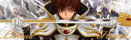
Those are all very nice. The last hand one catches my eye. 10.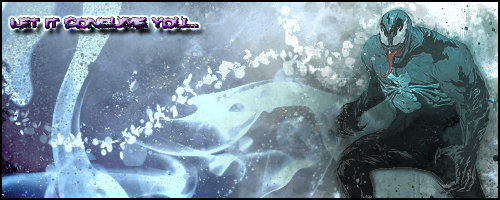
When you're bored...
If anyone can teach me how to make a better signature, PLEASE DO.
I wish to learn.
-
01-20-2011, 07:47 PM #1107Osmium
- Join Date
- Dec 2010
- Location
- In a land far far away when Donkey's eat Unicorns while they play Monopoly.
- Posts
- 667
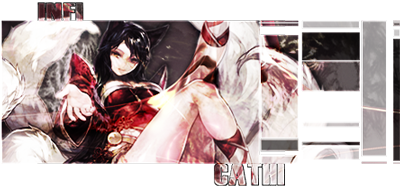
mmm... 6/10, but only because I like more thinner, rectangular sigs. o.o... there's just something about the outline of the random gold/black thing that throws me off. >:T!

HALP MEH. ;___; is it girly?
Click on the picture, cutie!
-
01-20-2011, 10:44 PM #1108Shadow Titanium
- Join Date
- Apr 2010
- Posts
- 384
FS sig: 8/10. Idk, maybe too many colors?
Current sig: 9/10. I like it.
640x360. Slightly different than previous submission, different shading on the snow, after this I won't be submitting any more of this one unless I have a major improvement or hint on things to do different. I'm considering using a completely different render and style for a new sig in the future, since this one is meant to be big.

1600x900 version: http://i54.tinypic.com/2ns8kfq.jpg
Also I slightly edited my original sig, including making the text bigger.Last edited by cadacus_ater; 01-20-2011 at 11:41 PM. Reason: wrong link i think


-
01-21-2011, 12:13 PM #1109Junior Member
- Join Date
- Aug 2010
- Location
- Most likely at home or playing futbol
- Posts
- 45
I agree with the colors opinion, but it's great regardless.
I also know what you mean by that gold thing, I couldn't find a suitable
c4d, and when I found that one I just put it there and yeah xD
When you're bored...
If anyone can teach me how to make a better signature, PLEASE DO.
I wish to learn.
-
01-21-2011, 02:15 PM #1110Osmium
- Join Date
- Dec 2010
- Location
- In a land far far away when Donkey's eat Unicorns while they play Monopoly.
- Posts
- 667
lol tbh, the only reason why there's that many colors is 'cause of Captain America. Not used to that.
I love the ice, though it looks like a sketch. The character itself is more simple, straight colors and shading; make the ice seem like that. Blur > Setting would be lighten. Maybe others, blur itself. Mess with the filters, make it seem icey... you know. Like dry ice or the breath you see when you blow out, on a nice, cold day.
well in photoshop, if you don't find a good color, I recommend pressing CTRL-U. it helps, you can move the option around, otherwise you can do colorize and change all of it at once. to make it one shade.
Enjoy~Last edited by infiCathi; 01-21-2011 at 02:21 PM. Reason: I GOT YELLED AT FOR PUTTING CAPTAIN PLANET INSTEAD OF CAPTAIN AMERICA. *RAGERAGERAGE* =___=
Click on the picture, cutie!

 Reply With Quote


 Posting Permissions
- You may not post new threads
- You may not post replies
- You may not post attachments
- You may not edit your posts
Bookmarks