


I love you >.<♥I love you >.<♥I love you >.<♥I love you >.<♥ from da back
Results 501 to 510 of 1683
Thread: Rate the Signature Above!
-
05-11-2010, 04:44 AM #501Osmium

- Join Date
- Apr 2010
- Location
- Hawaii
- Posts
- 664

Siggy By Rasecx!
-
05-11-2010, 04:47 AM #502Banned
- Join Date
- Apr 2010
- Location
- N/A
- Posts
- 3,643
I love you >.<♥I love you >.<♥I love you >.<♥I love you >.<♥ long time
-
05-11-2010, 09:11 AM #503Banned
- Join Date
- Apr 2010
- Location
- In a cookie jar
- Posts
- 1,026
^ Already rated
7/10 Assimilation
-1 because the render doesn't fit well with the background
-1 Random lights
-1 Not really digging the b/w in that pic :x
for the Kratos one:
9/10
-1 because the color scheme isn't all that good IMO ;x
Did this just in the library at my school...don't have my tablet with me so some parts are messed up a bit >.<

Annnnnd more verticals...


Last edited by YumCookies; 05-11-2010 at 05:23 PM.
-
05-11-2010, 05:07 PM #504Titanium
- Join Date
- Apr 2010
- Location
- Behind that bridge
- Posts
- 174
5/10
Floating head, weird lighting imo. Lots of random C4D effects, the white brush/smudge at the left is sort of 'O.o' imo.
8.5/10 Nice FX though things seem a bit chaotic and random. Colored version is nice and has a nice feel to it.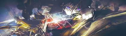
-
05-11-2010, 05:23 PM #505Banned
- Join Date
- Apr 2010
- Location
- In a cookie jar
- Posts
- 1,026
Haha, I actually had no tablet since I did the first one in my school library so the smudging was reallllly messed up xD Originally Posted by Error

For the second I actually didn't like the colored one at all, but now that I look at it more, I like it xD
8/10
-1 Because I don't really like the head chopped off part, it took me at least a minute to figure out what the pic was of
-1 Left side is kind of empty
But, I do however love the random blue/ green light along with the depth of the sig in general
More rates for these would be nice
Last edited by YumCookies; 05-11-2010 at 05:31 PM.
-
05-11-2010, 07:07 PM #506Osmium
- Join Date
- Apr 2010
- Location
- In your mind.
- Posts
- 846
7/10
8/10
-1 for BW
-1 for lightning that seems out of place
-1 for background

-
05-11-2010, 08:16 PM #507Shadow Titanium
- Join Date
- Apr 2010
- Location
- Akihabara
- Posts
- 377
thor ftw, 8.5/10 lol still need votes on mine, only the first one, other 2 are generated
no tuts ftw though =D
-
05-11-2010, 09:46 PM #508Banned
- Join Date
- Apr 2010
- Location
- In a cookie jar
- Posts
- 1,026

8/10
I like the design and everything but it seems like you need to put more time into them and give them some eye catching effects!
This is my first time trying a vector style type design in a sig...

Kinda bright ikr ._.Last edited by YumCookies; 05-12-2010 at 12:47 PM.
-
05-12-2010, 01:46 AM #509RedOsmium
- Join Date
- Apr 2010
- Posts
- 1,218

^_^
-
05-12-2010, 11:14 AM #510Banned
- Join Date
- Apr 2010
- Location
- In a cookie jar
- Posts
- 1,026
Made a new sig...

V.2

V.3

Last edited by YumCookies; 05-12-2010 at 12:48 PM.

 Reply With Quote


 Posting Permissions
- You may not post new threads
- You may not post replies
- You may not post attachments
- You may not edit your posts
Bookmarks