


Uhhh...Ummm... 8.2
Results 511 to 520 of 1683
Thread: Rate the Signature Above!
-
05-12-2010, 11:24 AM #511Junior Member

- Join Date
- May 2010
- Location
- Houston, Tx.
- Posts
- 7
SESSHEOMARU (retired)
Server: Mercury
Level: 94
Class: Force Blader
Steel431
Server: Mercury
Level: 145
Class: Warrior
Snipers Get More Head
-
05-12-2010, 12:15 PM #512Titanium
- Join Date
- May 2010
- Location
- Henderson, NV
- Posts
- 73


-
05-12-2010, 12:47 PM #513Banned
- Join Date
- Apr 2010
- Location
- In a cookie jar
- Posts
- 1,026
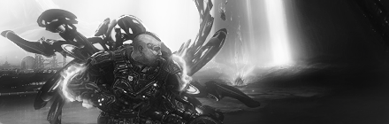
I love these. They just look epic... Originally Posted by Assimilation

Only thing is that I didn't really like your choice in a c4d for the back... :x
9/10
Need rates

V.2

V.3


-
05-12-2010, 04:12 PM #514Titanium
- Join Date
- May 2010
- Location
- Henderson, NV
- Posts
- 73
7/10
-
05-12-2010, 05:06 PM #515Osmium
- Join Date
- Apr 2010
- Location
- In your mind.
- Posts
- 846
7.5/10
7/10
I can't really see whats going on in the picture

-
05-13-2010, 08:36 AM #516Banned
- Join Date
- Apr 2010
- Location
- In a cookie jar
- Posts
- 1,026
-1, light pictures like that look better without borders
-1, light looks off
+1, cloud smudging and sparkles
9/10
Made a new sig again x.x

-
05-13-2010, 04:19 PM #517Titanium
- Join Date
- May 2010
- Location
- Henderson, NV
- Posts
- 73
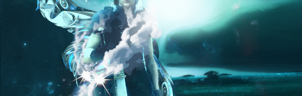
Couldn't see where the render ended at first; but after that, I made sense of what was going on, lol. Other than maybe the color of the text "Yummy", it's good. Also, it seems like you've been using the same style, not that it's bad, but try somethin' new! 8/10. Originally Posted by YumCookies

-
05-13-2010, 04:38 PM #518Shadow Titanium
- Join Date
- Apr 2010
- Posts
- 484
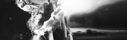
I totally disagree about yum's text. It looks fine. Any other color and it would either clash, stick out too much, or look TOO matchy.
The Lady has Spoken
-
05-14-2010, 01:30 AM #519RedOsmium
- Join Date
- Apr 2010
- Posts
- 1,218
^_^
-
05-14-2010, 03:17 PM #520Banned
- Join Date
- Apr 2010
- Location
- In a cookie jar
- Posts
- 1,026
Silent:
Everything is great, but in my opinion it could be more interesting [such as adding more depth to it]
9.5/10
Cyr:
It was originally suppose to be a vertical tag, which is why the right hand side is pretty empty lol. Didn't really know how to put the text on.
8.5/10
Rate these 2 please
First time using a c4d render for a background :x

This one just looked epic to me XD

Last edited by YumCookies; 05-15-2010 at 12:43 AM.


 Reply With Quote


 Posting Permissions
- You may not post new threads
- You may not post replies
- You may not post attachments
- You may not edit your posts
Bookmarks